Toasts deliver messages to communicate an ongoing process or, sometimes, a result of a user action. They typically disappear after a set interval or upon user dismissal, offering a non-intrusive way to provide feedback.
Usage
When to use
- To communicate a background process that has either started or ended, e.g., “Creating cluster”.
- To allow a user to quickly revert a destructive action.
When not to use
- To display contextual associative errors (e.g., form validation) or promotional content, consider Alert.
- As a dialog to confirm an action, consider Modal.
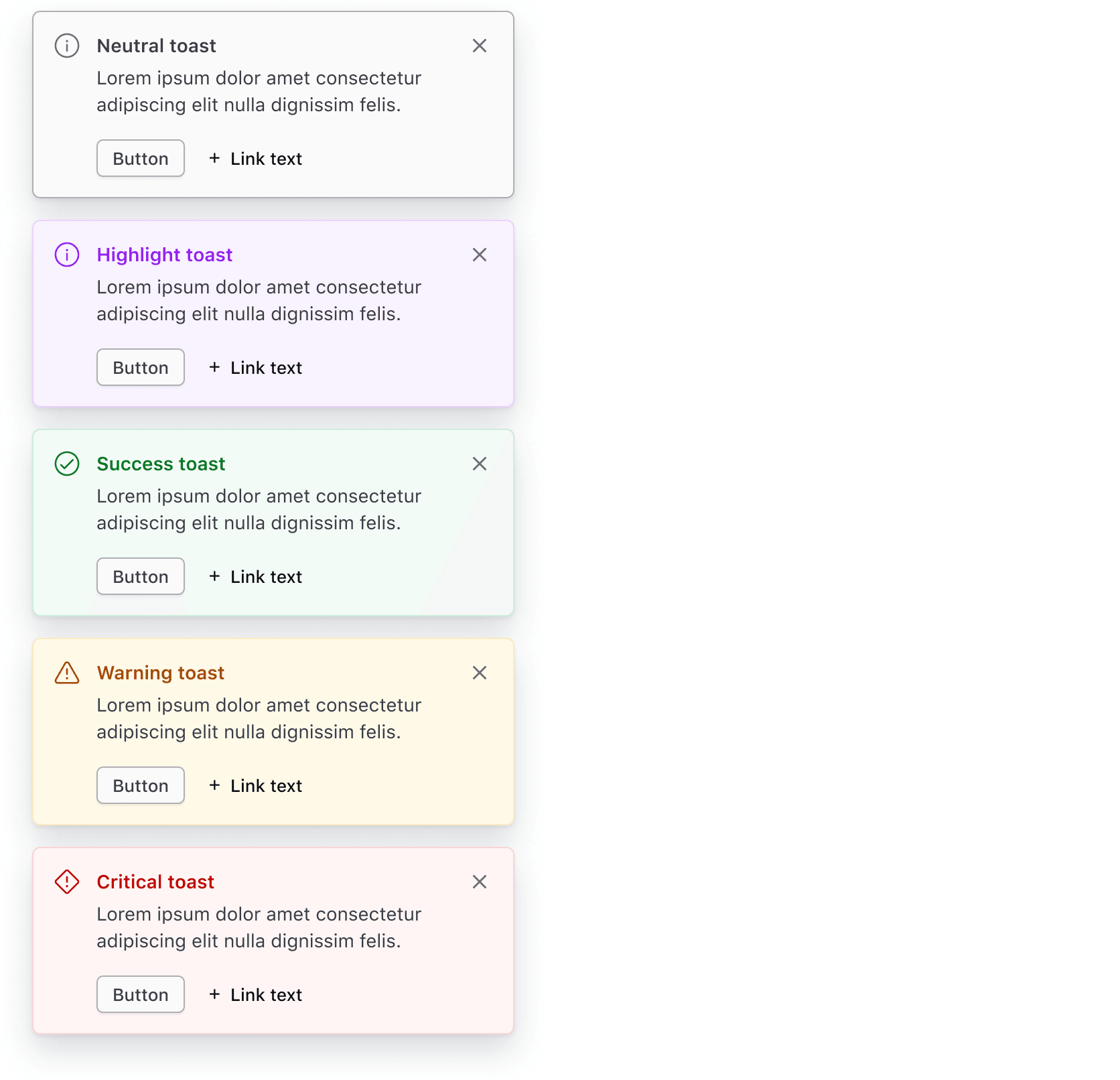
Color
Use color logically:
- Neutral: provide general information to the user about an ongoing process.
- Highlight: use interchangeably with
neutralwhen more prominence is needed. Use sparingly. - Success: indicate a successful action was completed.
- Warning: indicate a successful action was completed but may have triggered a related issue. Provide guidance and actions if possible.
- Critical: indicate an error or critical issues resulting from a failed action.
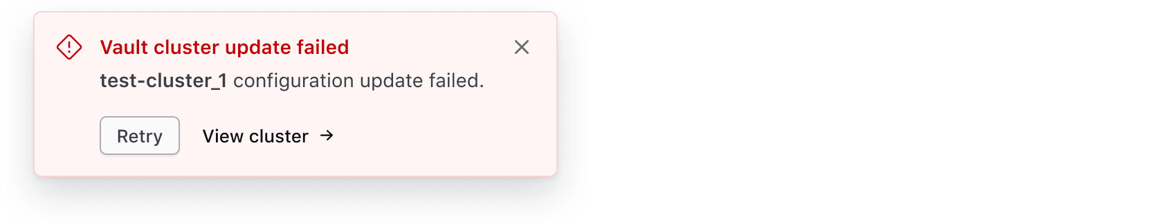
Critical toasts
Critical Toasts often persist (until dismissed) as they hold important information that requires the user's attention. Read more about when a toast should persist or timeout.
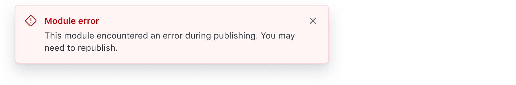
Use the Toast to provide non-intrusive feedback to users about the failure of an ongoing task or request. For example, a failure while deleting a cluster.
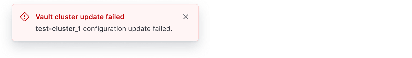
Use the Toast to communicate error messages that are not caused by the user. For example, an unsuccessful Vault cluster creation due to a failure while validating the deployment.
Don't use toasts for intrusive message communication about errors or critical disruptions at an application, page, or section level. Use the Alert instead.

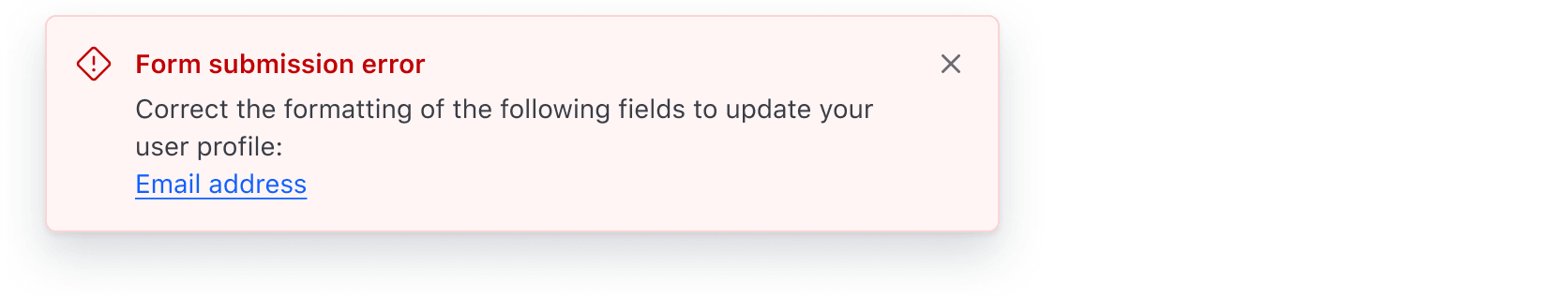
Don't use toasts to communicate validation errors. Use the Alert instead.
Icons
All Toasts have icons by default that are intentionally tied to the Toast color.
Icons within neutral and highlight Toasts can be replaced with other icons. Change them only when the new icon provides the user with extra value; otherwise, use the default icon provided.
Size
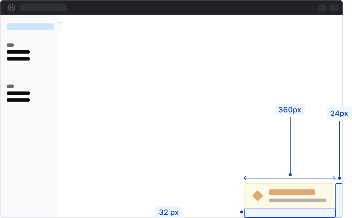
Toasts can be sized between 360px and 500px wide. Anything wider than 500px is considered disruptive to the user experience and may cover important information on the page.
Placement
Toasts appear in the bottom right corner of the viewport with a margin of 32px from the bottom and 24px from the right side of the viewport. If a warning or error is contextual to a specific UI feature, such as a form, directly associate an Alert to that feature instead of using a Toast.
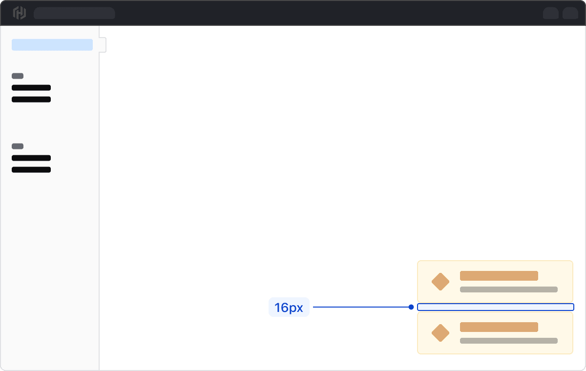
Displaying multiple Toasts
When displaying multiple Toasts, they should stack vertically with a 16px margin between each Toast. For consistency, each stacked Toast should be the same width.
When to persist or timeout
A Toast can either persist until the user dismisses it or be automatically dismissed via a timeout.
If a Toast contains actions or critical information (often associated with a warning or critical toast), it should persist until the user dismisses it. Keep in mind that when a Toast persists, it will remain visible across all pages until dismissed.
Timeout best practices
When a Toast is set to timeout, it should auto dismiss after seven seconds. Content within Toasts that time out should be as concise as possible with only a few words, e.g., “Cluster created,” to allow enough time for a user to notice and read the contents before it auto dismisses.
We recommend setting a timeout for neutral, highlight, or success Toasts only. This ensures that critical information or information that requires immediate attention is not missed.
While we provide visual styling for this component, the product team must implement other features like placement, transitions, and what happens on dismiss (e.g., with an Ember addon).
How to use this component
The basic invocation requires the type argument, an onDismiss callback function, and the title and/or description content. By default a neutral Toast is generated.