Usage
When to use
- When two related inputs (often a key and value) are repeated for batch submission.
- When collective validation of each associated row is required.
When not to use
- When inputs in each row are not closely related, use the form layout helpers instead.
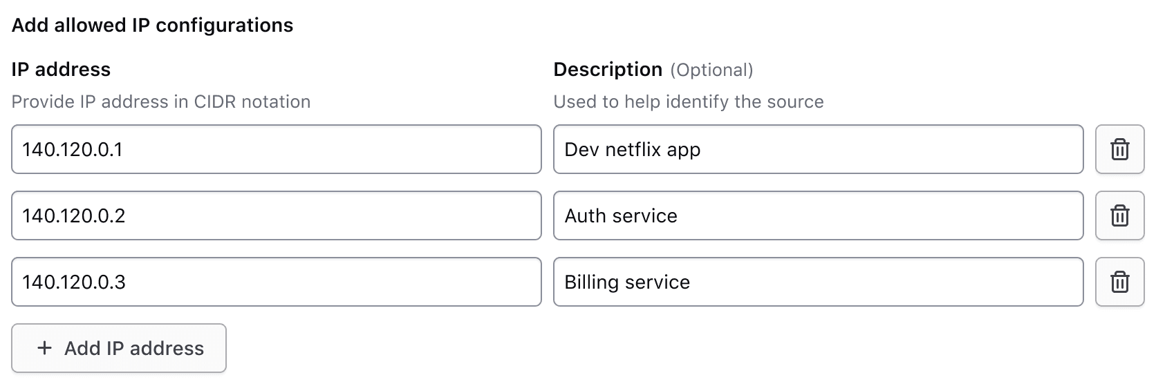
Header
The header for the Key Value Inputs includes a legend, helper text, and a generic content slot.
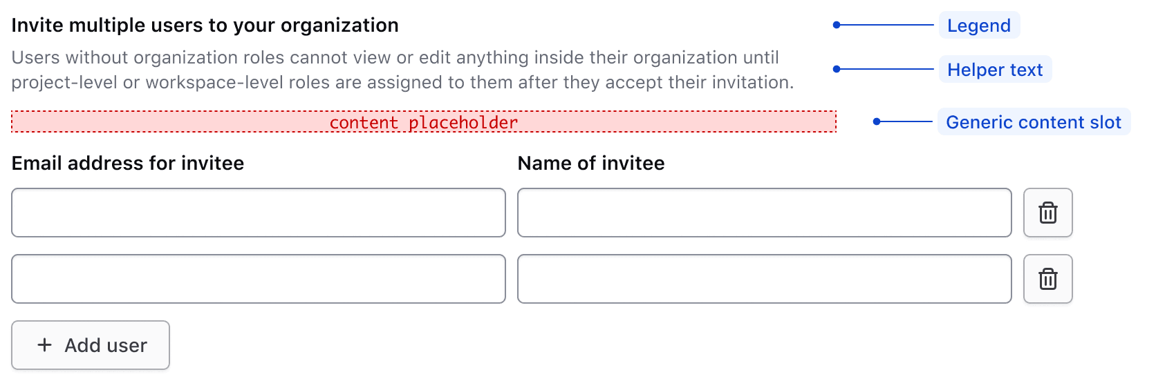
Legend
A legend is required to provide context for the overall fieldset.
Regardless of whether the Key Value Inputs component is placed together with other form components, or used on its own, a legend is always mandatory.
With other elements
The legend's usage with other form elements present.
Alone in form
The legend's usage when the Key Value Inputs are the only form element on the page.
Helper text and generic content
The optional helper text and generic content slot can be used to provide additional information that applies to all rows.
Use the helper text and generic content slot to reduce the amount of repeated information in each row. This focuses the user’s attention on data submission.
Don’t repeat information in each row if it can be explained once at the top of the rows.
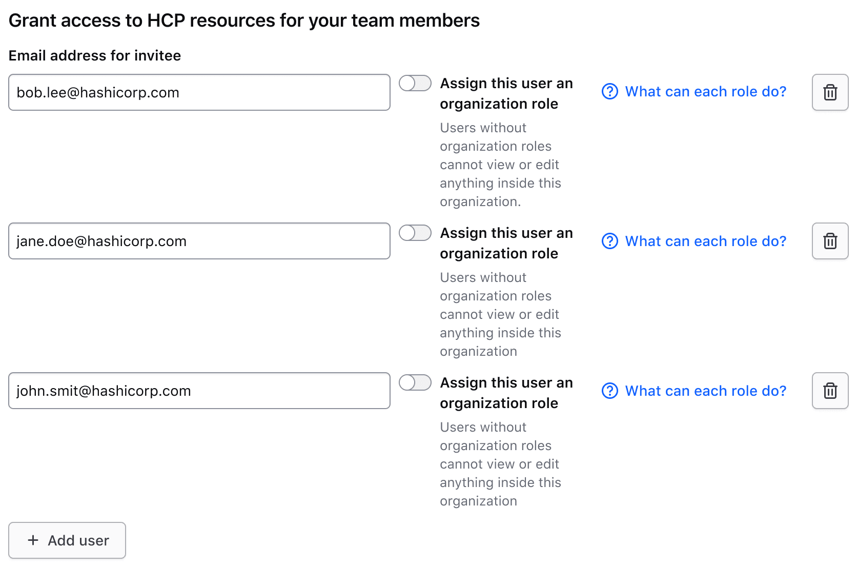
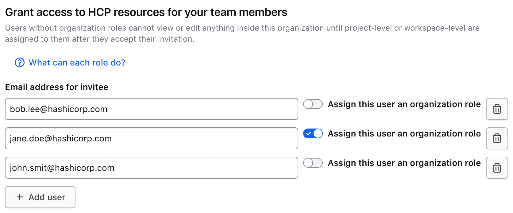
Input rows
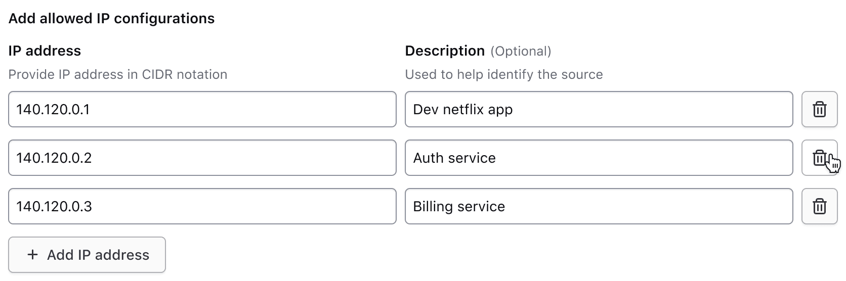
Each row typically includes two inputs, one for a key and one for a value. However, there may be exceptions where a single input may be necessary.
Input types
The Key Value Inputs component can contain various types of form elements, but there are some common patterns that represent the majority of HashiCorp use cases.
For the key input, this includes:
- Text Input
- Select
For the value input, this includes:
- Text Input
- File Input
- SuperSelect
- Masked Input
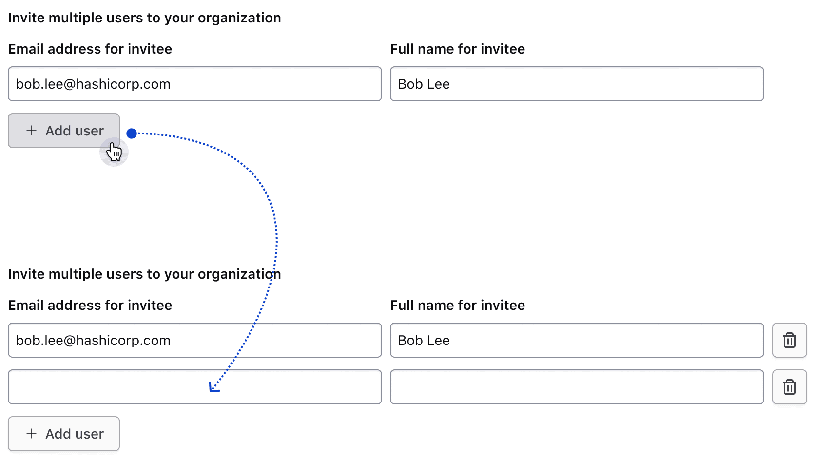
Adding rows
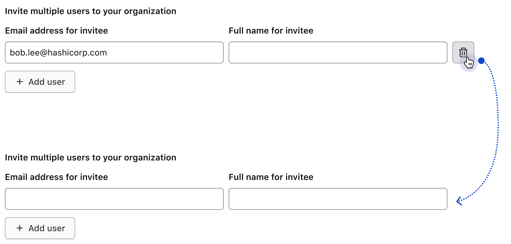
Users can add rows to the set of existing rows via the add button.
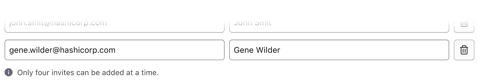
Hitting a row limit
If there is a row limit and the user reaches it, the add button should be replaced with an inline alert notifying them of the limit.
If the maximum number of rows has been reached and the user deletes a row, the alert should be replaced with the add button.
Delete behavior
The interactions in this section are intended to be implemented by the consumer. At least one row should remain visible at all times.
Single row behavior
If the row's inputs are empty, the delete button will be hidden.
Once content is entered in either of the two inputs, the delete button will become visible. Clicking it will remove the row's data and hide the button.
More than one row behavior
If more than one row is present, users can opt to delete any of the rows.
Footer
The footer includes an add button, compact alert, or fieldset validation.
Add button
The add button is displayed by default and, when clicked, appends a new row to collect additional information. The labeling of this button follows our content guidelines, e.g., "Add {object}."

Maximum number of rows reached
Use a compact alert to notify the user when they've reached a maximum number of rows. While the content can be customized, we recommend using the following message: "Only {maximum number} {objects} can be added at a time."
This uses the compact neutral Alert to avoid visually competing with other high-priority feedback, such as input errors.

Validation
If a specific error is associated with the fieldset, it will be displayed below the add button.
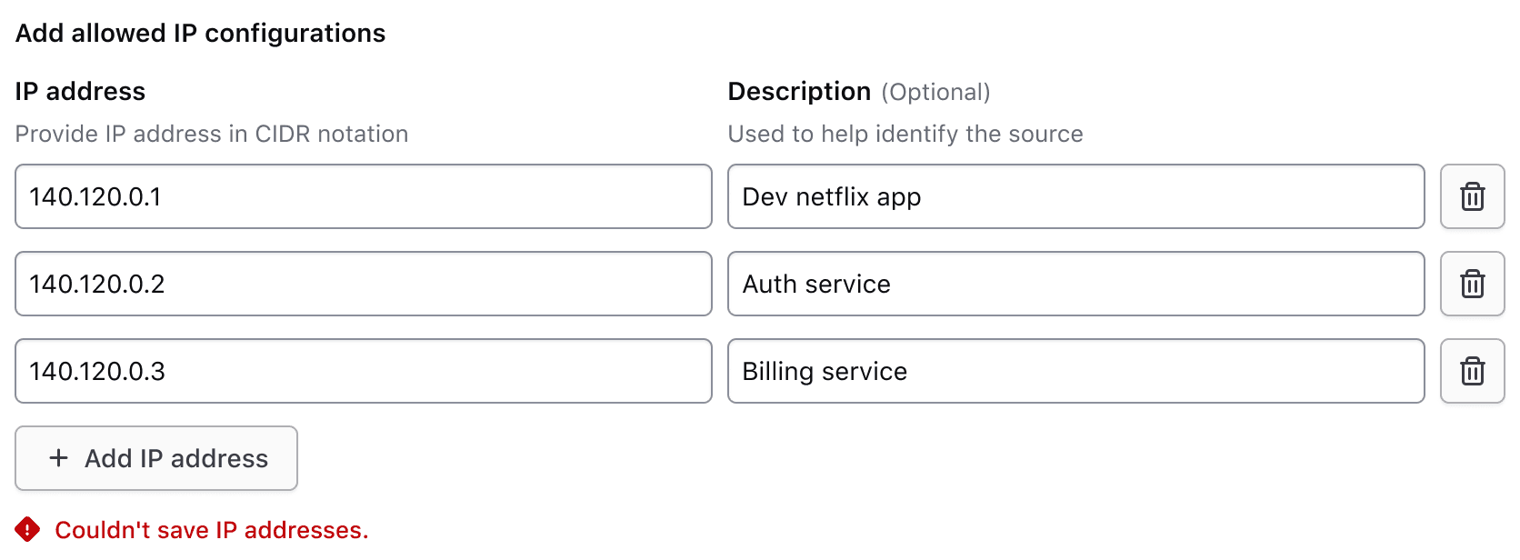
For additional information on form validation, read more about this in our form patterns validation documentation.
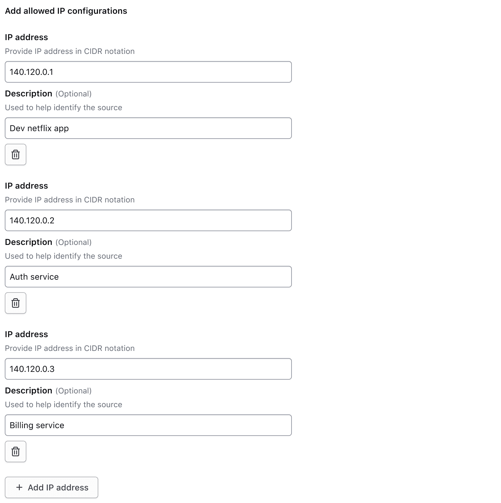
Responsive behavior
Medium and above
In viewport sizes that are greater than or equal to the medium (md) breakpoint, the label and helper text are only visible for the first row of inputs. This reduces visual clutter by condensing the form elements.
Less than medium
When the viewport is less than the medium (md) breakpoint, all field elements stack to occupy 100% of the container width and display the label and helper text for their associated inputs. As the form height increases, the visible labels and helper text orient the user as they scroll down and fill in information. If repeating each input’s helper text isn’t useful to the user, consider placing that information in the fieldset helper text instead to reduce the visual noise.
How to use this component
The basic invocation of the Key Value Inputs requires the @data argument. This is used as the initial data to create the rows of inputs.
Each input is associated with a field, that contains a label; the input; and an optional indicator, helper text, and error message.
<!-- ========================================================================================
Note: this is a non-interactive example, used to demonstrate how the @data argument
and the different sub-components are combined and invoked, to achieve the desired layout
========================================================================================== -->
<Hds::Form::KeyValueInputs @data={{array
(hash email="j.maxene@randatmail.com" name="Judith Maxene")
(hash email="e.aishah@randatmail.com" name="Elmira Aishah")
}}>
<:header as |H|>
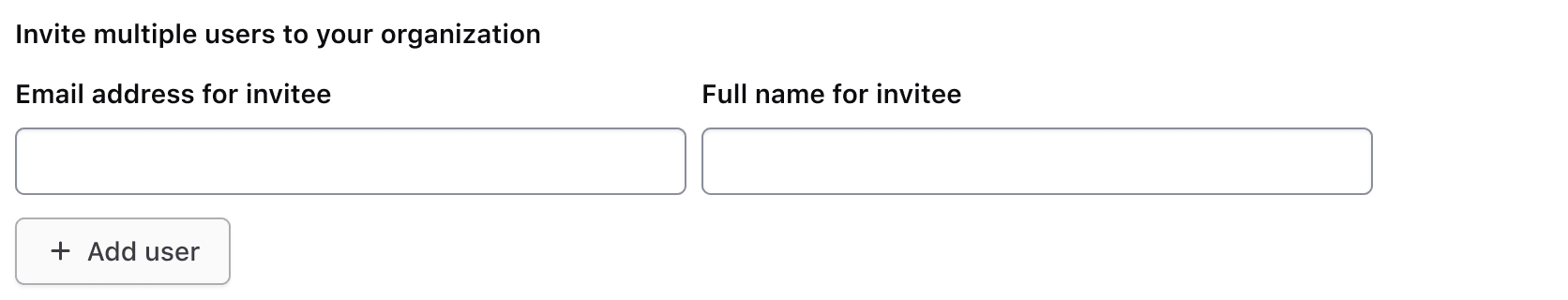
<H.Legend>Invite multiple users to your organization</H.Legend>
<H.HelperText>
Users without organization roles cannot view or edit anything inside their organization until project-level or workspace-level roles are assigned to them after they accept their invitation.
</H.HelperText>
</:header>
<:row as |R|>
<R.Field as |F|>
<F.Label>
Email address for invitee
</F.Label>
<F.TextInput @value={{R.rowData.email}} />
</R.Field>
<R.Field as |F|>
<F.Label>
Name of invitee
</F.Label>
<F.TextInput @value={{R.rowData.name}} />
</R.Field>
<R.DeleteRowButton />
</:row>
<:footer as |F|>
<F.AddRowButton @text="Add user" />
</:footer>
</Hds::Form::KeyValueInputs>
Required vs. optional
Use the @isRequired and @isOptional arguments to add a visual indicator that the entire Key Value Inputs is required or optional.